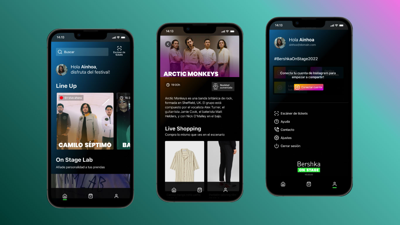
Aimsun Live
This has been one of the projects I have been involved in since I started working at Aimsun in 2019. First as an intern, then as Digital designer and now as Front-end designer.
Aimsun is a Siemens-owned company dedicated to developing traffic simulation software and offering related services to thousands of customers and governments around the world.
Aimsun Live is one of the products in the portfolio; it is basically a decision support tool for traffic operators, i.e. it simulates several scenarios in parallel based on the current traffic situation so that operators can anticipate possible traffic jams or road issues and stop them before they happen.
When I joined the team, Aimsun Live had already been implemented in cities in the USA and Australia, however, it did not yet have its own UI, so showing its functionalities to potential new customers was complex. That's where I came in.
At the beginning of the project I was still a student of a Master in UI and UX, so having the opportunity to face a project of this dimension was very motivating for me. The first challenge we had was to transform a large list of previously existing functionalities into a simple and well organized UI. Until that moment Aimsun Live was implemented on top of the UI they had in each of the traffic control centers.
As it was a product that was already operating, there was a product manager and he had already prepared a product backlog with what we had to have inside the UI. So together with the other designer of the team we got down to work and organized all this backlog within an interface as simple as possible, always trying to keep the workflows clean and useful for the operators.
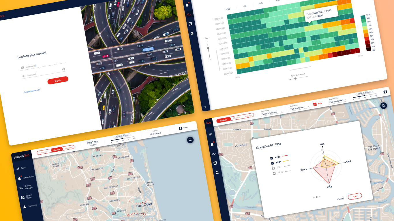
Live UI 1.0
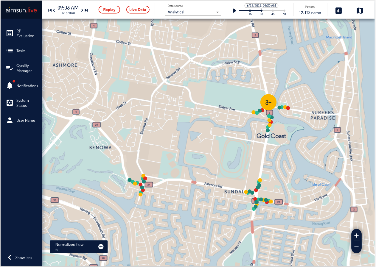
In this first version of the interface, the main challenge was to organize a large amount of input data so that it would be useful for the traffic operator. Despite the amount of data, everything had to be clear within the main context, the map. This is because the map is the most important hierarchical element at the graphical level.
Around the map we organized the elements in two main groups:
1. The column on the left: where the operator can interact and control everything related to the application in general:
- Historical results of evaluations occurring in the background.
- Previous and running tasks
- A window to check the quality of the input data
- Notifications related to the status of the system and running tasks
- A window to check the overall system status in one place
- Access to the traffic operator's personal profile.
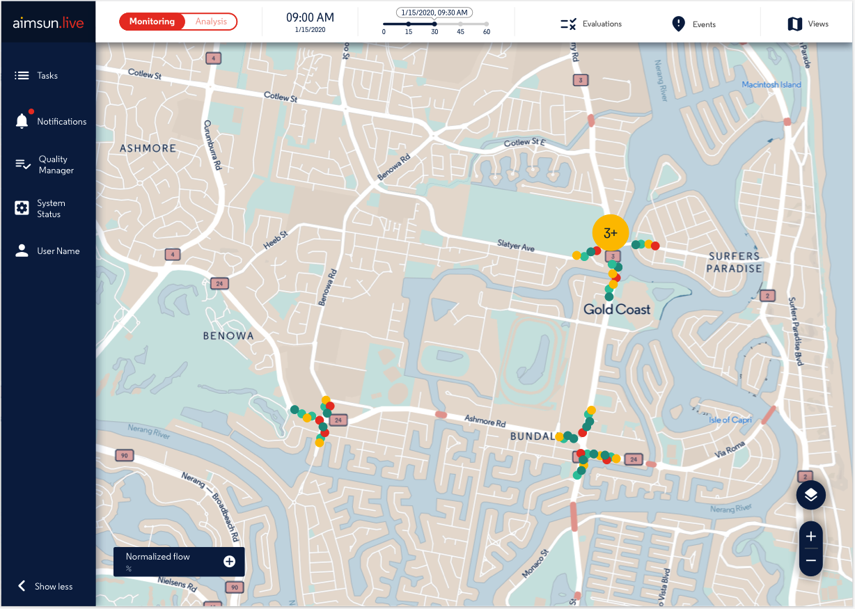
2. The top control bar: where the operator can adjust and configure what he wants to see or hide on the map. This was the most complex element to design, in Aimsun Live the data seen on the map can come from three different sources: real data, analytical data or simulated data.
Each of these sources has its own characteristics and therefore unique requirements both graphically and interactively.
Our first approach to this problem was a dropdown menu, where the operator can select each of the data sources, depending on the selection the context bar changes and offers different options.
This first version helped us to organize the mental map of how the information should be organized and to know what and when we should show the traffic operator a specific data. With this version, the product manager together with the engineers started to test and give us their feedback, so we went on to develop the second version of the prototype.
Live UI 2.0
Starting on this version, I will focus only on the top control bar, since it is where we have done the largest number of iterations due to its complexity.
From the first version we understood that a dropdown menu was not the best option because we are preventing the operator from seeing all the data sources he can use to support his decisions. In addition, we noticed that the terms we were using could be confusing, especially Analytical and Simulated.
For this reason, after analyzing it with the product manager and taking into account the feedback received, we reduced the number of options to two much more concrete and easy to understand, and we transformed the dropdown menu into a toggle with two positions:
1. Monitoring: that allows operators to run new evaluations and also to create new events on the map.
In version 1.0 the new evaluations were executed from the left column, but in the tests we saw that this is actually interpreted by the operators as something inherent to the map and not to the system in general. On the other hand, the creation of events on the map came as a new requirement of the need for operators to record accidents, closures, and other situations that may occur in traffic.
2. Analysis: This brings together the previous sources of information from the dropdown menu.
- Real data: which allows the operator to review the traffic situation in real time, can review the different radars and devices installed on the road network and can navigate through 15-minute time horizons to see how traffic has evolved in the last hour.
- Decision support: This is a new tool born from the feedback obtained from version 1.0. After the tests, we understood that in the first version we presented a lot of raw data, which, despite having great potential, were very difficult to analyze at a glance for the operators, making the decision making process slower than required.
Thus, we created a tool that presents the quantitative results of different evaluations in different tables and graphs on a single screen, allowing the operator to switch on or off with a checkbox any of the results, and thus make a decision based on the KPIs in the interface.
Finally, in this view the operator can visualize the result of one of the evaluations on the map or, if desired, create a new traffic response plan directly on the map.
With this new version, we are entering a new stage of testing, showing the interface to traffic operators of nearby customers. So far none of the tests have been with a web prototype. All tests have been done with Sketch wireframes.
Live UI 3.0
This is the third and most recent version of the interface, here we have refined details and adjusted elements based on the feedback received in the testing of version 2.0.
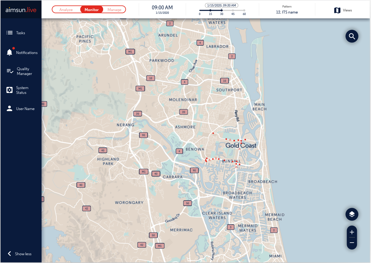
The biggest change is the top control bar, here the toggle went from having two to three options. This change is mainly due to the incorporation of new requirements to create different types of incidences in the map: events, actions, action plans and evaluations.
For this reason, the bar is now as follows:
1. Analyse: as in version 2.0, this mode allows the traffic operator to view traffic information based on real data and also to access the decision support tool, which in this version has been improved and now each of the steps is on a different screen for easier viewing.
2. Monitor: from which the creation of events has been removed and is now a mode exclusively for checking the status of the map, see where there are incidents and review data from radars and sensors installed on the road network.
3. Manage: is the new mode incorporated in version 3.0 due to the new types of incidents as mentioned above. Below I explain what these incidents are and their importance that was detected during the tests in previous versions:
This is the third and most recent version of the interface, here we have refined details and adjusted elements based on the feedback received in the testing of version 2.0.
- Events: It is the closure of lanes on a road, they can be real or test depending on the objective of the traffic operator.
- Actions: These are measures taken in response to the events of the previous point, so that the traffic operator can determine whether to change the traffic light plan, close a turn, close or enable another lane, etc...
- Response plans: These are plans that consist of defining which actions respond to which events within the traffic plan, these are defined by the traffic operator based on the events and actions defined in the previous two points.
- Evaluations: This is the highest level, where the traffic operator can evaluate and compare different response plans so that at the end, with the help of the KPIs and the decision support tool, he can define which is the best plan of action against a possible traffic incident.
Each of these new incident types involved the creation of interfaces dedicated to their creation and management.
Another change, no less important, was the change of words that were standardized in their infinitive form, for example from "Monitoring" to "Monitor".
Up to this point, the road has been full of learnings that keep coming with each feedback. Currently the development team is moving the entire Sketch design to a web platform where traffic operators will be able to work with the application using real data. This is when the next stage of fine-tuning will begin.
At the product level, the management team is very satisfied with the result, as besides helping to improve the usability of the product for the end user (the traffic operators) it is also being a success for the sales team, as they now have a product that is much easier to show to potential customers.